The grant bulletin
When you’re bored of your brand (and what to do about it)
Restless with your own logo? You’re definitely not alone.
Insights

It wouldn't be outrageous to be a tad repelled by the term "disruptive." It's a bit of an overplayed anthem of the start-up world, and in the anti-hustle movement, it might even trigger the "ick."
So, let me break it down: when I toss around this word, I'm not discussing some groundbreaking business maneuver; I'm talking about the perception side of things – visuals, vibes, and feelings. In the Direct-to-Consumer (DTC) universe, brands can't just sit on a shelf waiting for folks to casually stroll past. DTC means grabbing digital onlookers by the metaphorical lapels. What makes people stop, drop, and scroll?
This is reinforced by:
Stopping digital wanderers can seem like a Herculean task, but when coupled with a genuine mission–to deeply connect with the right humans–it mostly demands courage. From my observations, founders fear disrupting TOO much and lug around their personal style biases. They might even be itching to inject their own aesthetic, whether it's from their living room or their closet. Not to state the obvious, but that's not the best route. Ultimately, it's not about what the founder fancies (at least visually); it's about the audience. Sometimes, these two elements align, but not always. And here's the kicker: we can't design something the demographic expects; it has to be disruptive.
We've all witnessed rebrands or launches that flop and barely make a ripple in the market. Usually, it's because they played it safe. Now, I'm not saying designers should hop on the trend bus or toss in neon just for kicks; being disruptive isn't practical unless it's authentic. That's where it's necessary to dig REAL deep with clients, understand the landscape, do the research, and then prepare them to see something different.
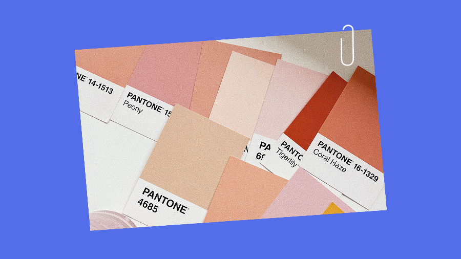
Let's consider a few different DTC categories (cookware, eco-friendly dental care, and cannabis), what you might expect those brands to look like, and a few examples of outliers doing it differently.

I mean, it's hard NOT to think of Martha Stewart in a perfectly-lit kitchen shot when considering the cookware industry. These are all well-made products with great reputations, and visually they fit right into what we all imagine in that category.
If you haven't heard of Our Place, your Instagram algorithm is clearly VERY different from mine. These guys are their own disruptors - where the product's design and photography are very different from the space they are in. Backed by a seemingly endless marketing budget, Our Place has become a huge dominator in the market, though not my main inspo for this segment.

Enter Great Jones, and their rebrand designed by powerhouse Pentagram. It's a significant deviation from their competitors' classic sans-serif, minimal, clean vibes. Where popular brands have increasingly lost personality, they took a u-turn and paired an almost vintage-esque wordmark with a bold colour palette and witty messaging. The result feels both unexpected and nostalgic, which is pretty genius in the cookware space. If this brand speaks to you, it's loud and proud, and naturally, competitors will start to fade into the background of your mind- getting blurrier and blurrier with each exposure.


And then comes Flaus. Who said that eco-friendly has to feel like a yoga retreat? In a space filled with bamboo, sunset-inspired gradients, and 90% whitespace, Flaus's website header is "Flossing doesn't have to suck". Is that level of bluntness a risk? Conservative nay-sayers might say yes, but I'd argue that boring website headers are even more risky. Back that up with a strong brand promise subheader that instils confidence, and you've hit the winning combo.
Flaus's subheader: "Award-winning sonic technology makes flossing as quick, easy and comfortable as brushing your teeth".

Designed by Aussie design firm Universal Favourite, Flaus only tried to be some things for some. From a beautifully weird wordmark to a deep commitment to using one bold brand colour (oh hello, neon teal) to a name choice that is simple while also being very reminiscent of trying to say the word "floss" while flossing, this is a perfect example of balanced disruption.
Painfully on-the-nose minimalist designs with highly unnecessary marijuana leaves OR stoner-esque visuals that give anxious people anxiety.
To deviate from these directions above, I've also seen some more minimalist approaches that are part of a larger movement to elevate the perception of using cannabis:

And then there's Houseplant. If I didn't love Seth Rogan enough before, his brand and product decisions for this business have me swooning. Designed by MA-MA and Pràctica, the colours are unexpected and are very much the star of the show, while the other details are kept very minimal so as not to compete. The typefaces: confident & bold. The graphics and illustrations are clean, geometric, and art-forward. As Houseplant expanded into cannabis-related homewares, this rebrand helped them create a brand architecture that's own-able, minimal, elevated, and distinctive. It's hard to be both minimal and unique, but the designers here clearly did their research and deviated from their competitors in the best way.

In a nutshell, DTC founders, be brave and resist the siren call of blending in. Consumers can't spot you if you're camouflaged, and we want you to be SPOTTED. Isn't that what we're all after?
Cheers to disrupting the mundane, my friends,
Ais
--
DTC | Direct-to-Consumer | Packaging | Product Design | Brand Identity | Visual Identity | Digital Marketing | Brand Design
Restless with your own logo? You’re definitely not alone.
Rebrands can be a pricey way to say “we’re bored.” What does your brand need?

Think logo animations, slick explainer videos, and animated social content.

Motion sounds fancy. Maybe even expensive. But it doesn't have to be!


