The grant bulletin
When you’re bored of your brand (and what to do about it)
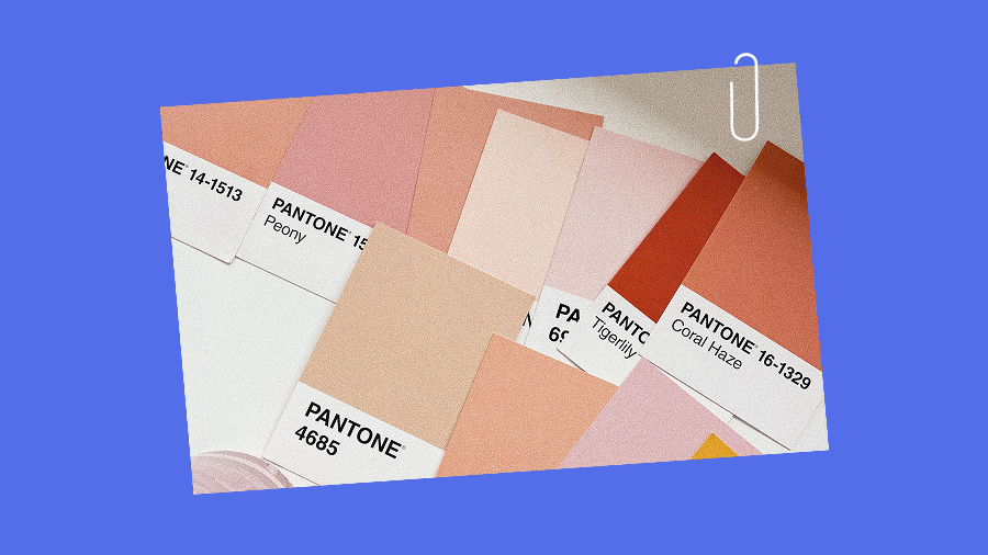
Restless with your own logo? You’re definitely not alone.
Insights

As much as we’d love to believe that we’re all independent thinkers and impervious to marketing ploys, the truth is – we’re not. At least not always. We are consumers, and like the magpies that dig through your alleyway garbage, we are also attracted to shiny things (and also sometimes garbage – amiright?). Our eyes are naturally drawn to the unique, especially amongst a similar collective, so why is it that so many of the same products end up looking the same, regardless of the company they come from? Well, lot’s of folks abide by the “If it ain’t broke don’t fix it” philosophy – but we disagree.
For example, name one egg company – we dare you.
You probably can’t, can you!? Because they all look the same! SO when it comes to packaged goods, the more memorable you are, the better. Because at the end of the day, you’re still going to buy your eggs, but wouldn’t you be more inclined to reach for a package that was say, hot pink perhaps? ****If you can manage to instil trust in the purchaser whilst breaking through the visual sameness - that’s a recipe for wonderment we’re on board with. There are plenty of ways to build trust with first-time and long-time buyers, but we’ll talk about that another day.
So let’s talk packaging – and take a peek at what really makes an amazing consumer experience, from the moment you see it on the shelf. Say hello to some of our 2023 food n’ bev standouts. Some are award-winners, and some are simply ones that we’ve been crushing on. Either way, meet some of our favourites:


Could we be anymore obsessed with this modern take on a classic? Vintage leaning fonts and imagery, paired with a bright, bold yet simple colour palette, AND a stunning print job!? STOP! We’re definitely not passing this one in the deli aisle (unless we’re vegetarian, then…yes we are).
Solid. Bold. Trustworthy. This one has our hearts.
Design by: Gander
Award: Dieline


All we want to do when we see this project is sing, “Isn’t She Lovely” by Stevie Wonder, over and over again. Stunningly simple, rooted in tradition and yet again, top notch custom print finishings (are we noticing a trend here?).
Design by: Auge Design
Award: Dieline


If you’ve been putting off eating snails, perhaps this packaging will sway you – we know it did us (well, some of us). The checker pattern on the edge is 🤌 making this a marvel at every angle. You can never go wrong with a classic, bold pattern, and keeping the illustrations minimal but highly detailed is subtle, but so so impactful.
Design by: Caserne


First of all – POCKET COCKTAILS!? Adorable. Secondly, the symmetry in these designs is nothing short of perfection. The type choices and treatments are spot on, and in a stubby can like this, how could your eye not be drawn to these lil’ babies.
Brand Identity: Land


The juice game just got a hell of a lot cooler. Eager’s entire take on simplicity is so well executed, it brings a tear to our eye (yes, we all share one single eye). By refraining from the use of anything superfluous, Eager 100% stands out on the shelves compared to many of its’ overly graphic-ed (we’re making it a word) competitors.
Design by: Ragged Edge


The definition of stunning simplicity. No bells and whistles on this baby, and because of this, there’s no way it’ll blend in with the crowd. In an industry full of fun and experimental design approaches, sometimes less is more, and with a one-of-a-kind bottle, you’re bound to be a cut above the rest.
Design by: Harrison Fun Studio
Thanks for stoppin' by!
Restless with your own logo? You’re definitely not alone.
Rebrands can be a pricey way to say “we’re bored.” What does your brand need?

Think logo animations, slick explainer videos, and animated social content.

Motion sounds fancy. Maybe even expensive. But it doesn't have to be!

Unboxing big personalities: Modern brands embrace authenticity
DTC branding: Disruption is your friend


