Voice Male Magazine
A new voice for modern masculinity.
Voice Male has been nudging conversations about equity, vulnerability, and social change since the 1970s—long before most of us had even heard the term 'toxic masculinity'.
While their mission has always been forward thinking, the magazine’s look was decidedly stuck in the past, and didn’t reflect the depth or warmth of the work being done inside. So, we stepped in. Not with a sledgehammer, but with a tuning fork.
Our goal was to craft a brand that felt warm, bold, and real. Not a TED Talk. Not a glossy fashion mag. Something that could sit confidently on a coffee table or in a barbershop. Design-savvy, but still inviting that could meet men where they are, whether they’ve been in the conversation for years or are just starting to lean in.
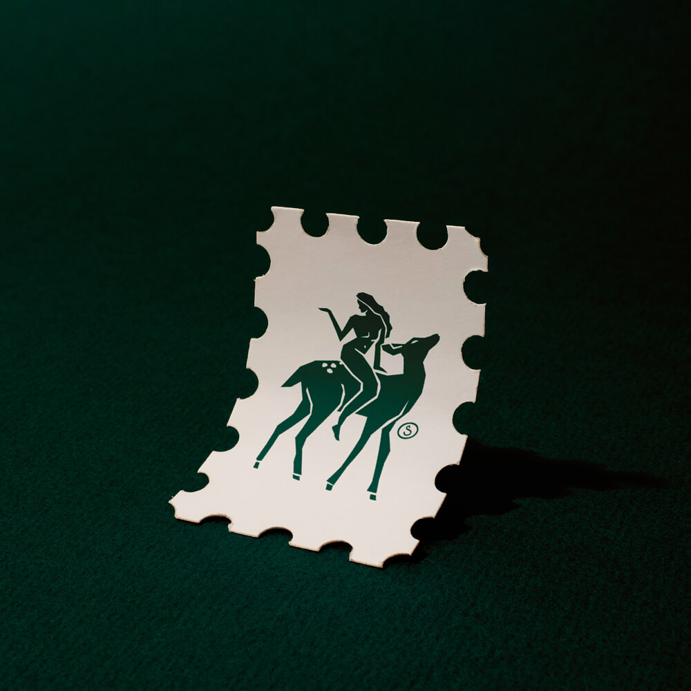
Voice Male’s new identity is grounded in vintage-modern typefaces that balance strength with soul. For colours, we landed on a bold yet approachable palette that’s masculine-adjacent without flexing too hard with warm, rich tones that feel modern without leaning too trendy. The photography direction embraces candid, flash-lit moments that reflect real life, while hand-drawn illustrations introduce a personal, imperfect touch that softens the boldness brought in through the core brand elements.
Every decision was made with the intention to create a safe space for men to explore the stuff they were taught to ignore. To build a brand that doesn’t feel like it’s preaching from a mountaintop, but instead pulling out a chair and saying, “hey man, let’s talk.”
What emerged is an identity that feels like a heartfelt conversation: relatable, intentional, and unafraid to go deep. A rebrand that looks sharp, feels human, and makes space for the kind of masculinity that’s ready to evolve—and ultimately reflects Voice Male’s activist roots while welcoming a new generation into the fold.
Contributions
Brand Identity
Industry
Publishing & Non-Profit
Year Completed
2025
Additional project details
Voice Male Magazine
A new voice for modern masculinity.

Voice Male has been nudging conversations about equity, vulnerability, and social change since the 1970s—long before most of us had even heard the term 'toxic masculinity'.
While their mission has always been forward thinking, the magazine’s look was decidedly stuck in the past, and didn’t reflect the depth or warmth of the work being done inside. So, we stepped in. Not with a sledgehammer, but with a tuning fork.
Our goal was to craft a brand that felt warm, bold, and real. Not a TED Talk. Not a glossy fashion mag. Something that could sit confidently on a coffee table or in a barbershop. Design-savvy, but still inviting that could meet men where they are, whether they’ve been in the conversation for years or are just starting to lean in.
Voice Male’s new identity is grounded in vintage-modern typefaces that balance strength with soul. For colours, we landed on a bold yet approachable palette that’s masculine-adjacent without flexing too hard with warm, rich tones that feel modern without leaning too trendy. The photography direction embraces candid, flash-lit moments that reflect real life, while hand-drawn illustrations introduce a personal, imperfect touch that softens the boldness brought in through the core brand elements.
Every decision was made with the intention to create a safe space for men to explore the stuff they were taught to ignore. To build a brand that doesn’t feel like it’s preaching from a mountaintop, but instead pulling out a chair and saying, “hey man, let’s talk.”
What emerged is an identity that feels like a heartfelt conversation: relatable, intentional, and unafraid to go deep. A rebrand that looks sharp, feels human, and makes space for the kind of masculinity that’s ready to evolve—and ultimately reflects Voice Male’s activist roots while welcoming a new generation into the fold.
Contributions
Brand Identity
Industry
Year Completed
Additional project details


— Jake Stika, Executive Director @ Voice Male Magazine
Grant Design immediately grasped the impact we wanted to make in our niche space, asking insightful questions that uncovered our deeper mission beyond mere aesthetics. What set them apart was their perfect balance of listening and challenging us to make bold decisions based on the impact we wanted to make, always backing their recommendations with strategic reasoning. Their organization throughout our project was impeccable—from intake to ideation, iteration, and final delivery. Every phase was structured yet allowed space for creative exploration. The results speak for themselves: our brand now authentically represents our vision while standing out in ways we wouldn't have achieved without their encouragement to make bold choices. I highly recommend Grant Design to any business seeking a design partner who truly understands your goals and has the courage to help you reach them.


Explore Recent Sprints